
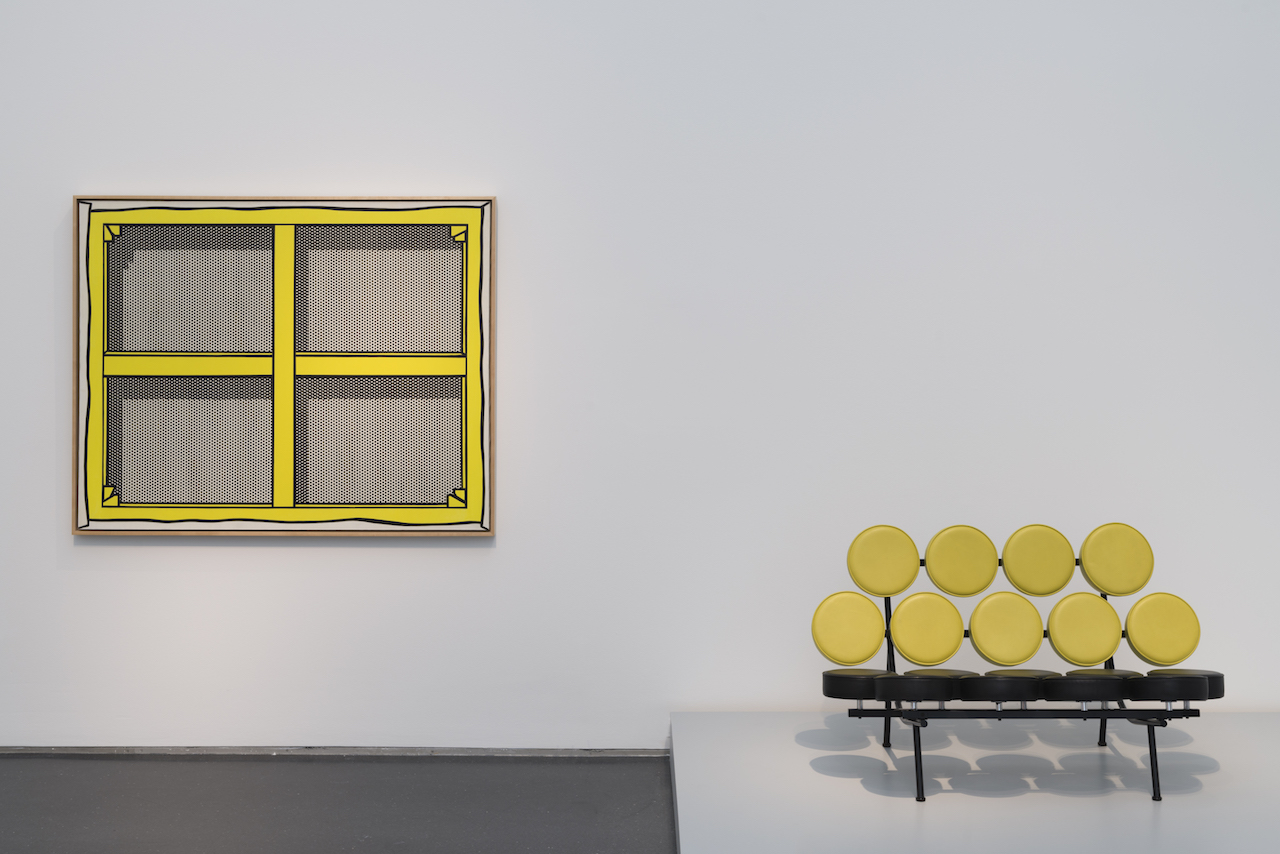
Installation view of ‘Pop Art Design’ at the Museum of Contemporary Art, Chicago (all photos by the author for Hyperallergic unless indicated otherwise)
CHICAGO — Three major exhibitions devoted to Pop art opened in 2015: The World Goes Pop at Tate Modern in London; International Pop at the Walker Art Center in Minneapolis (opening soon at the Philadelphia Museum of Art); and Pop Art Design, still on view at the Museum of Contemporary Art (MCA), Chicago. Each broadened the purview of this art movement as a primarily Western (American) phenomenon by unearthing lesser-known artists to provide a global view of art in the 1960s and ‘70s. But, at the same time that these exhibitions effectively changed our notion of Pop art, they also lost something in translation. Each of the shows, heavily padded with work that proved a point, made us wonder what, exactly, the point was. By cracking open the geographic reach of Pop art, the exhibitions became amorphous, losing sight of what lay at the core of this art movement.
As these exhibitions illustrated, artists around the world did indeed scoop up the language of popular culture, mass media, and the middle class from their respective socio/political perspectives, as well as muddy the lines between high art and everyday life. But what these exhibitions didn’t explore was how Pop art reached the masses, how it gained power through dissemination.
Pop art was at its most effective and subversive when its sassy attitude and frolicking rejection of propriety infiltrated not just the art world but the outer boroughs, reaching into pockets of isolation to touch the farm kid in Manitowoc, Wisconsin, the garage musician in Cleveland, and the housewife in Duluth. This was the infectious, democratic, shining glory of Pop art. Faster than any previous art movement, its kitschy, carefree currency spread fast, from London-based artist Richard Hamilton’s first collage exploration, “Just what is it that makes today’s homes so different, so appealing?,” (1956) to Roy Lichtenstein’s appearance in LIFE magazine (1964).

Installation view of ‘Pop Art Design’ at the Museum of Contemporary Art, Chicago, with ephemera, design, posters, and album covers (click to enlarge)
The only exhibition that comes close to defining and celebrating this important populist characteristic of Pop art is the exhibition that originated at the Vitra Design Museum in Germany and is currently on view at the MCA (its only American stop). Pop Art Design slides intuitively toward the vernacular tentacles of this movement and makes us realize that every exhibition of Pop art should include facts and artifacts along with the tattered remains of Andy Warhol’s cover design for the Rolling Stones’ Sticky Fingers album (1970–71) and the Milton Glaser poster from Bob Dylan’s Greatest Hits (1966). As Warhol says in The Philosophy of Andy Warhol, “good business is art … art had gone into the stream of commerce, out into the real world.”
The art world was far away from the Wisconsin suburb where I grew up. Yet, Warhol’s Interview Magazine came in the mail each month. Effervescent against a Midwestern suburban landscape, it brought news of a sophisticated ‘elsewhere.’ Prior to that, Mattel launched the Skipper doll in 1964 as Barbie’s little sister. Her hip cousin from England, Francie, was introduced in 1966. These gals were sweet and coy at first, but soon their wardrobes exploded under some kind of atomized Warhol influence — faux fur, mini-dresses, plastic go-go boots, hot pink shirts with daisy prints, fishnet stockings. It was as if Warhol didn’t just pee on the copper surfaces of his Oxidation series, he urinated all over America (and perhaps the world), leaving his scent in every Sears and Roebuck toy department, every kitchen and teenager’s bedroom. The Swinger Polaroid Land Camera (1965, designed by Henry Dreyfuss) allowed us to be as cool as Warhol, with this black and white plastic object dangling from our wrists, participating in the self-documentation of the period’s rebellious collective swagger. There was a new, expansive cultural reach embedded in the DNA of Pop art. The New York art scene bled into products quickly.
Installation view of ‘Pop Art Design’ at the MCA Chicago (photo by Nathan Keay, © MCA Chicago)
Since the beginning of modern art, artists have tried to free themselves from commodification and its taming whip. The history of Modernism is a history of rebellion. But like the Bauhaus, Pop art found a strange comfort and alliance with the commercial world that became mutually agreeable. Pop art wasn’t art for the people, but it was art for the in-crowd made accessible to the people. We were all invited.
Did art in the 1960s change the world of design, or vice versa? Or did they curiously cohabitate for the first time and maybe the last? Should any Pop art exhibition omit the shape-shifting commercial manifestations and plurality of this era? Exhibitions like the Walker’s and Tate Modern’s, which hover in the art world, miss the unique essence of Pop art: Not only did Warhol insist that art was a product, he happily watched products become art. As the art historian Marco Livingstone has stated, Pop art was more of a sensibility than a movement or a manifesto.
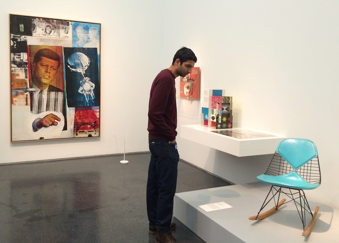
Installation view of ‘Pop Art Design’ at the Museum of Contemporary Art, Chicago, with works by Robert Rauschenberg (left) and Charles and Ray Eames (right)
Pop Art Design opens with Robert Rauschenberg’s “Retroactive II” (1963), from the MCA collection. As if making a map of postwar culture, Rauschenberg silk screens, transfer prints, and collages images of an astronaut on the moon, John F. Kennedy pointing authoritatively toward the viewer, a smeary detail from an Old Master’s painting, and a weather meter onto what reads as an 80 by 60 inch poster. Gone is the hand of the artist and notions of preciousness, originality, emotive content, or linear narrative. Replacing them are the pervasive reality of reproduction via news and television media, and the idea that it is all passing by increasingly fast.
Adjacent to the Rauschenberg sits the wicked little Charles and Ray Eames chair from 1951/52, lacquered steel wire with a turquoise blue vinyl pad, shackled with wooden rocking chair runners. What could the Rauschenberg and the Eames have in common? Apparently, it is the notion of collage as well as the invention and industry of the time: mashing up bits and pieces from cultural sources, old and new, into whimsical objects imbued with the optimism of infinite potential. The seams and incongruities of the compositions invest these artifacts with the era’s ‘anything is possible’ attitude, be it a moon landing or a total retooling of everything from convenience foods to music to grandpa’s rocking chair.
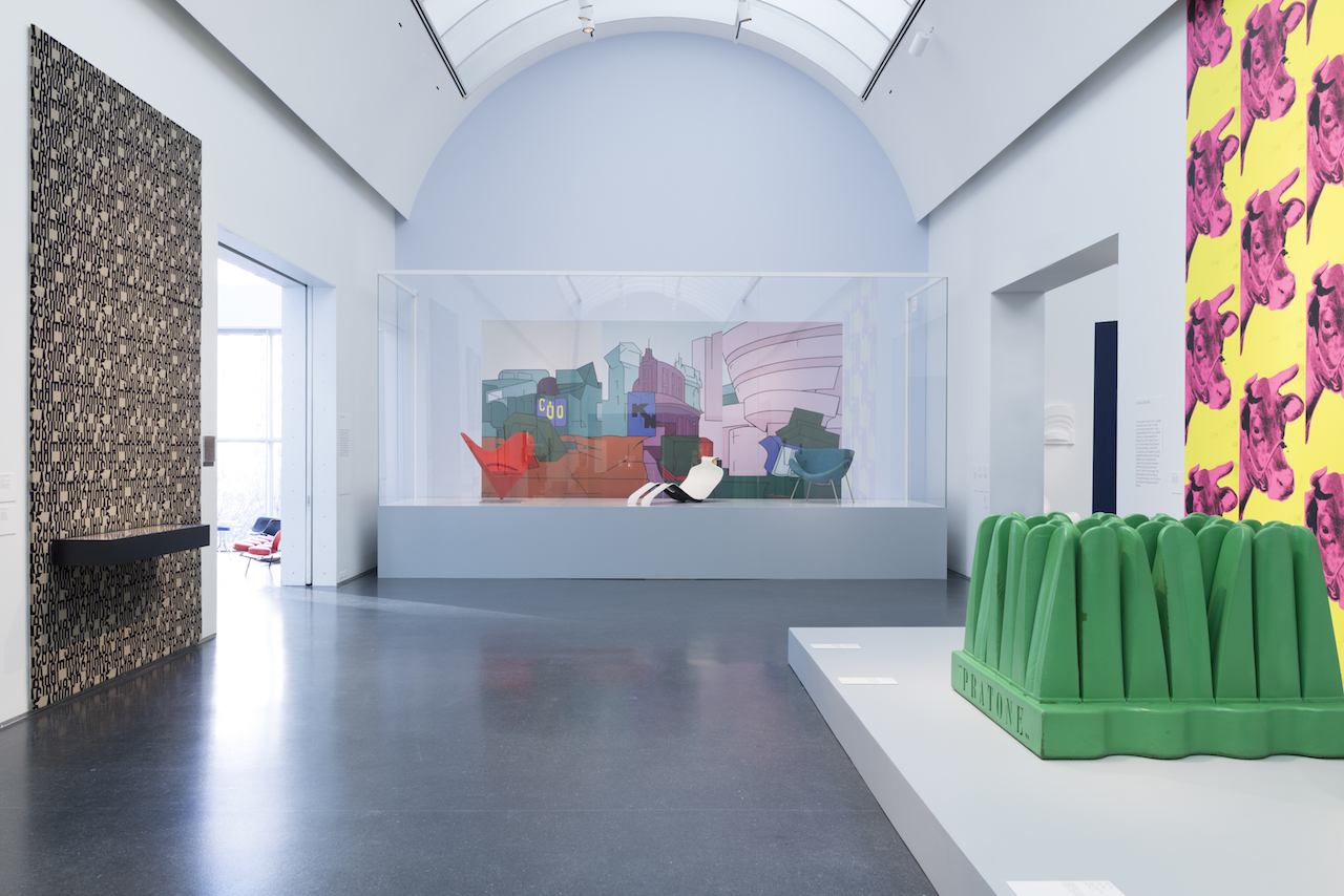
From here the exhibition continues to bounce between fine art and product, without neglecting the space in between. This allows for inclusions like the Warhol-inspired disposable paper “Souper Dress” (1966–67) — available as a company promo by mailing in two Campbell’s soup can labels plus one dollar — which appears between a functional Coca-Cola vending machine (1947–51), an Italian Simon International tomato soup stool (1973), and a Warhol “Campbell’s Soup Can” screen print on paper. Outrageous exploits with the newfangled possibilities of post-war plastics take every possible twist and turn, from Gruppo Strum’s Pratone lounge chair (1966) — which is actually a giant Polyurethane foam piece of fake grass that you can walk through or sit on — to the Italian designer Guido Drocco’s Cactus (1971), a piece of shaped Polyurethane foam that looks like either a giant, obscene plant or a coat rack. Another Italian, Gaetano Pesce, offers a chair in the form of a giant foot. Designers around the world, freed from practical constraints, were having fun, something almost anathema to our current anxious condition.
If we are lucky, every well-curated exhibition holds a moment of surprise, something that interrupts expectations. This exhibition, which unfortunately features predominantly white male artists and designers and feels gendered in its celebration of historically validated artifacts versus the more unruly landscape of the domestically soluble trickle-down Pop products that littered Midwestern homes and closets, has one dimly lit room in its far back corner dubbed “Artificial Worlds.” Like entombed radioactive laboratory specimens, emanating and enshrined in a plastic vitrine mounted on the wall, fully disinfected from residues of onion dip, Jell-O, and Cool Whip salad, are four plastic Tupperware bowls. This is where things get interesting. Why include just this one artifact of plastic fantastic 1960s kitchen culture? Why Tupperware? While it would be nice to credit the curators with a fresh insight, the Museum of Modern Art had already validated Tupperware’s streamlined, injection-molded polyethylene contours as good design in a show of 20th century design in 1956.
Nonetheless, Tupperware has its own interesting story. Invented by Earl Tupper around 1942, it was propelled to success a decade later by an industrious single mother in Detroit, Brownie Wise, who launched the home-party mode of sales. Some (such as the writer Alison J. Clarke) would argue that Wise empowered women of the 1950s and ’60s, who were newly minted as “housewives,” to engage in their own means of collective agency. Four small Tupperware Wonder bowls, in pastel hues inspired by Tupper’s love of Florida orchids, are displayed like practically sacrosanct objects. A nearby wall of Danish designer Verner Panton’s Ring lamps (1969/2000) provides the perfect funky, ethereal echo. At this shining altar of mid-century mass consumption, this final room of the exhibition, functioning like a chapel, says everything about Pop art: it touched us all, saturating our lives with synthetic joy.
Installation view of ‘Pop Art Design’ at the MCA Chicago (photo by Nathan Keay, © MCA Chicago)
Installation view of ‘Pop Art Design’ at the MCA Chicago (photo by Nathan Keay, © MCA Chicago)
Pop Art Design continues at the Museum of Contemporary Art, Chicago (220 East Chicago Avenue, Chicago, Illinois) through March 27.

No hay comentarios:
Publicar un comentario